

Geometric Harmony: Behind the Scenes of an Unusual Abstract Process
Creating "Geometric Harmony” has been an exciting journey, evolving from a very unusual beginning to a carefully layered mixed-media composition. In this blog post, I’m sharing the process of how this piece took shape, along with photos from its early stages and a final setting to show how it might look in a home.
Inspiration and Strange Beginnings
I began this piece on a whim, inspired by the natural curving shapes of kale leaves from our garden. The first layer started with loose, broad brushstrokes, which acted as the base for the many papers and shapes to come. These early stages had chaotic energy, with overlapping shapes and muted colors. Not knowing the final result, I proceeded to add geometric shapes and more color. With somewhat of a vision of geometric harmony, I was inspired to combine collage elements in a way that would create a structured, yet whimsical feel.
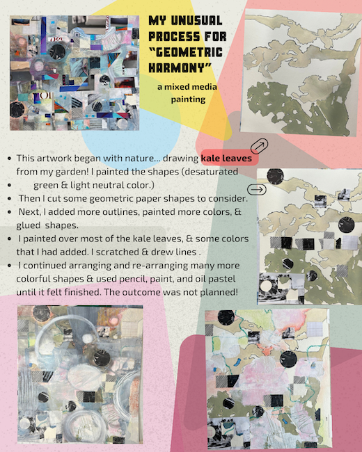
Who would think that the initial step this art process (top right) would eventually lead to the culmination in a complex geometric abstraction?
Building Layers and Adding Texture
As an artist I know some question to ask yourself while working such as: “What do I “not” have?” or “What does this painting need?” Since I originally had curved, organic shapes I added geometric and rectilinear shapes. my first layer had muted, desaturated colors, so I intuitively added brighter colors and black and white to contrast with the grey-green.
By creating contrast, in addition to repetition with variation, the artist can lead the viewer’s eyes around the work. Over time, the piece transformed as I added layer upon layer. I used a variety of collage papers: magazine shapes, patterned papers, and small sections with text. Each paper brought its own texture, color, and personality to the piece. I played with the placement of each shape, from the smallest dot to large, bold blocks, arranging and rearranging them until they formed a balanced composition.
Paint also became a key part of this journey. Between layers of collage, I added washes and touches of paint to bring unity to the work and create depth, along with some lines and patterns with other media. Subtle shades of turquoise, soft blues, grays, and hints of bright colors added a sense of dimension. The process was a back and forth of intuition and critical thinking.
The Surprising Transformation
When you see “Geometric Harmony” in its early stages, you might not believe this was the start of the final piece! As the artwork evolved, I made countless changes, adding new elements and covering others, letting the piece “speak” as I worked. Some pieces were removed or covered as the composition shifted, creating a balance that feels both intentional and organic. The art took on different personalities as it progressed.
When complete, I sprayed it with two coats of a UV protective satin varnish. I also applied a satin medium with a brush and a final thin coat of cold wax for extra protection. I chose a contemporary custom size, wide satin charcoal-grey frame to give the artwork some space in which to rest.
Whatever it is, the way you tell your story online can make all the difference.
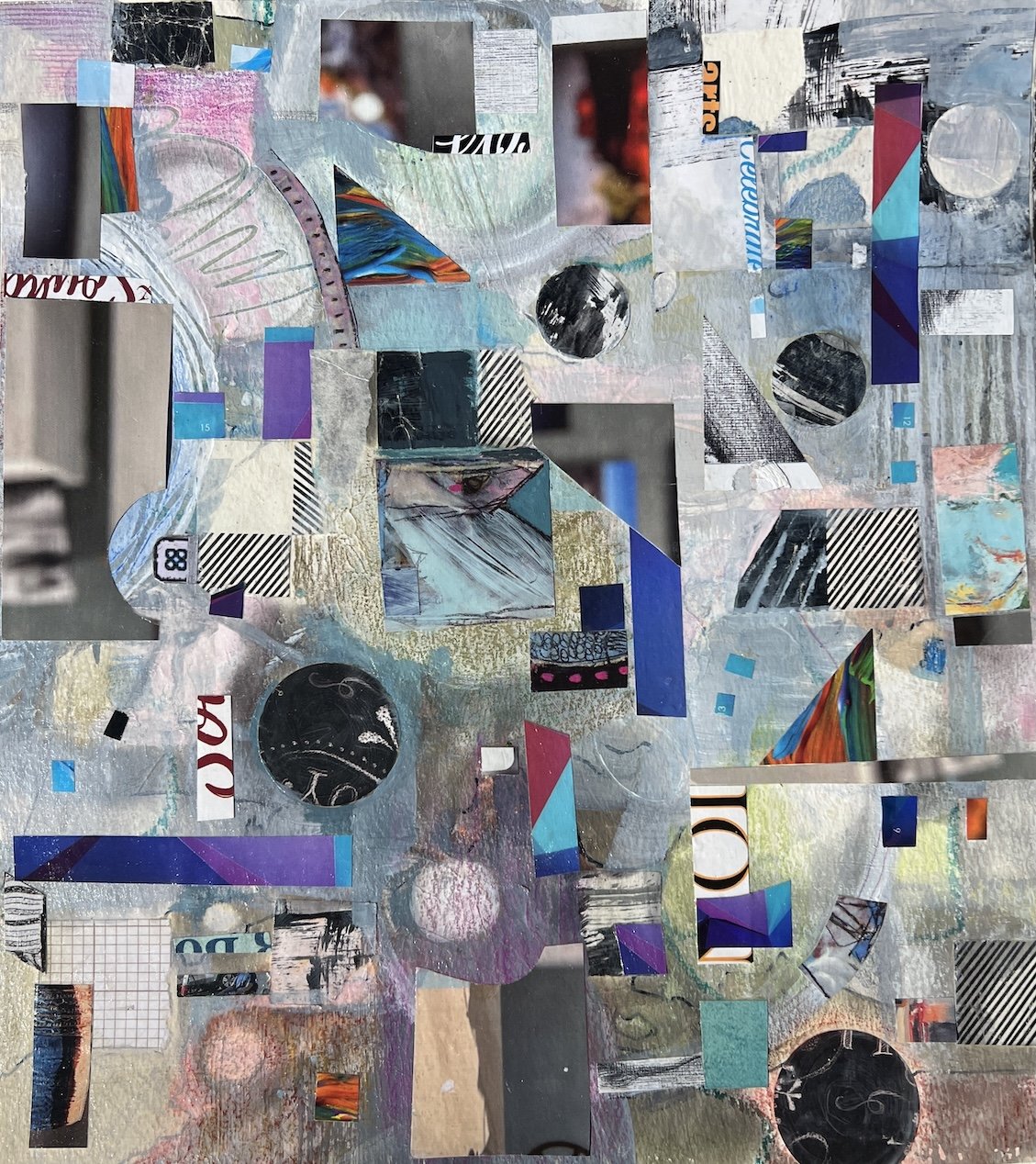
The Final Look: Bringing it All Together
In its finished form, my contemporary mixed-media painting has a harmonious balance of colors, shapes, and textures. It invites the viewer to explore each section, discovering new details with every glance. This piece adds a touch of abstract intrigue to any space, transforming walls into points of interest that spark conversation and curiosity.
I hope you enjoyed this glimpse into my creative process. Here are a few photos showing Geometric Abstraction at different stages, including how it might look in a living space. This piece is ready to bring life and character to a new home, where it can be enjoyed for years to come.

Completed painting with the frame I chose for it. I love the way this setting incorporates black and grey geometric decor to complement my contemporary mixed-media painting.

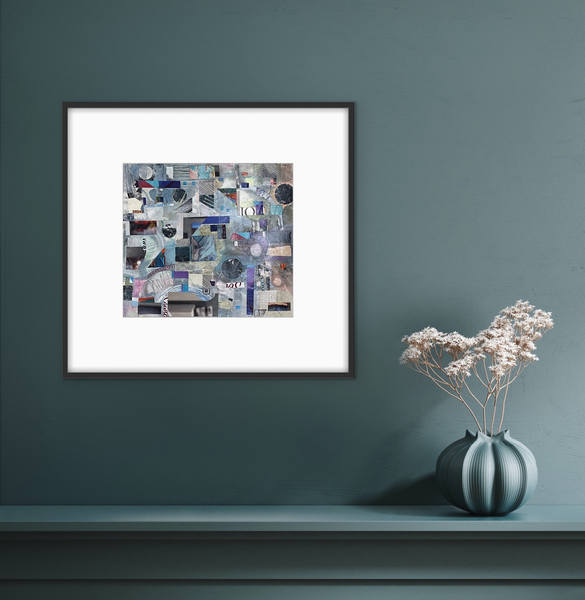

Before framing my art, I created some room-view images of my art on a wall to showcase the art with interior decor. This image, along with the one above, illustrates alternative framing options. (The black teapot and cup coordinate well, don’t they?)